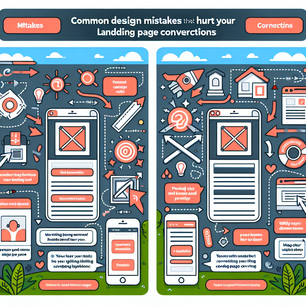
Common Design Mistakes That Hurt Your Landing Page Conversions
A well-designed landing page is crucial for converting visitors into leads or customers. However, many businesses make common design mistakes that can negatively impact their conversion rates. In this article, we explore these common pitfalls and provide tips on how to optimize your landing pages for maximum effectiveness.
Table of Contents
- Lack of Clear Call-to-Action (CTA)
- Overwhelming Design and Clutter
- Slow Loading Speeds
- Non-Responsive Design
- Inconsistent Messaging
- Poor Use of Color
- Ignoring Trust Elements
- Lack of Social Proof
- Unclear Navigation
- Conclusion
Lack of Clear Call-to-Action (CTA)
One of the most critical elements of a successful landing page is a clear and compelling call-to-action (CTA). A CTA guides visitors towards the desired action, whether it’s signing up for a newsletter, making a purchase, or requesting more information. A common mistake is burying the CTA within the content, making it difficult for users to find and act upon.
Overwhelming Design and Clutter
An overly crowded landing page can confuse visitors and deter them from converting. A clean, minimalist design with ample white space allows users to focus on the most important elements. Keep the design simple and intuitive to ensure the visitor can easily access the essential information without feeling overwhelmed by too many elements.
Slow Loading Speeds
In today’s fast-paced digital world, users expect websites to load quickly. A slow-loading landing page can lead to high bounce rates as visitors lose patience and leave. Optimize images, leverage browser caching, and reduce HTTP requests to improve your page’s load time.
Non-Responsive Design
With an increasing number of users accessing websites via mobile devices, having a responsive design is crucial. A non-responsive landing page that does not adjust to different screen sizes will frustrate users, potentially leading to higher bounce rates. Ensure your landing page is mobile-friendly and offers an optimal viewing experience across all devices.
Inconsistent Messaging
Consistency is key when it comes to messaging across your landing page and advertisements. Mismatched messages can confuse visitors and lead to distrust. Make sure the content, tone, and style of your landing page align with your marketing campaigns to provide a cohesive user experience.
Poor Use of Color
Color schemes play a significant role in user perception and behavior. A common design mistake is using colors that clash or fail to highlight important elements such as the CTA button. Use color psychology to strategically employ colors that convey the right emotions and draw attention to crucial aspects of the page.
Ignoring Trust Elements
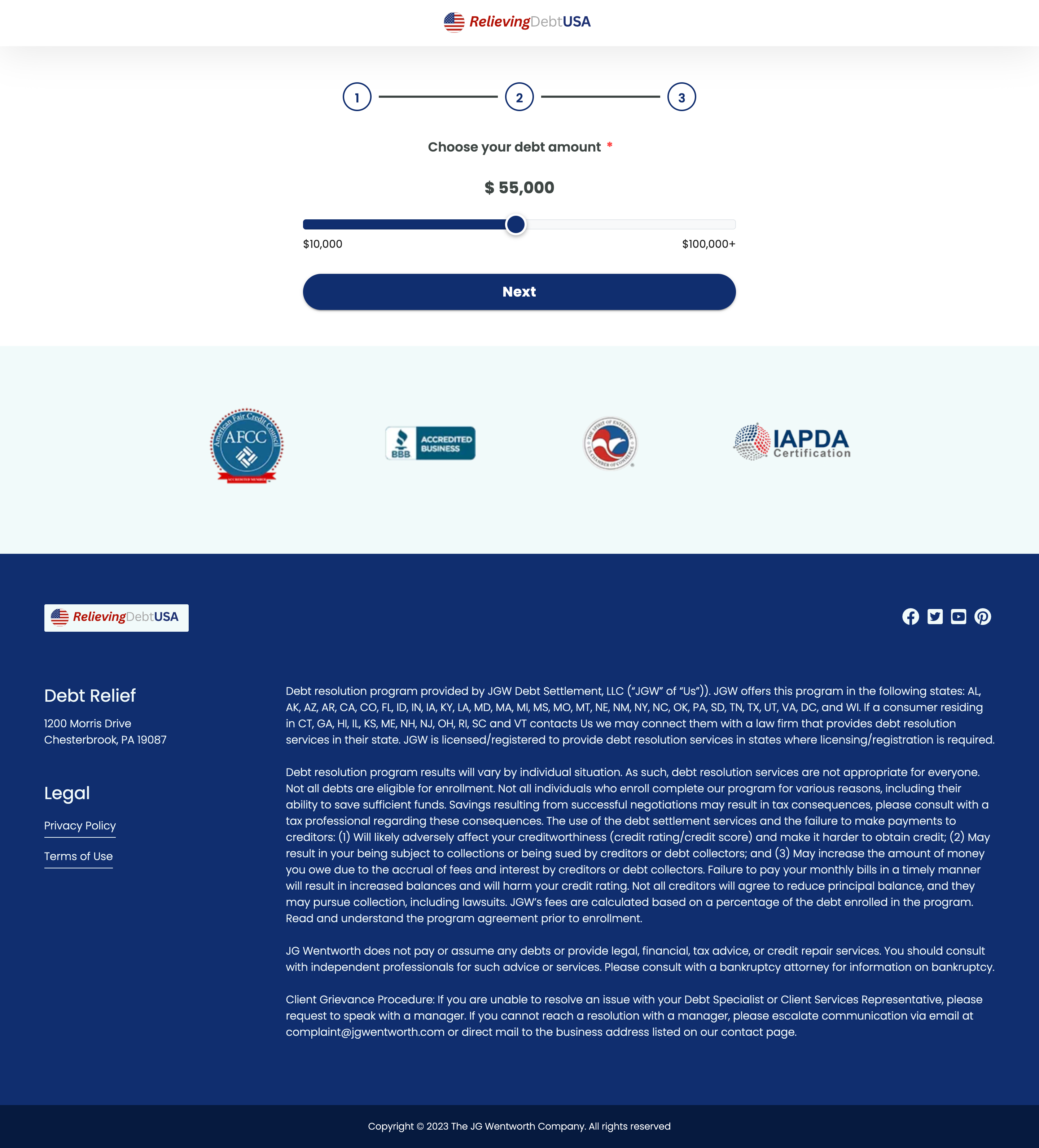
Trust elements, like customer testimonials, security badges, and guarantees, play a vital role in reassuring users and boosting conversions. Omitting these elements can hinder your trustworthiness and result in visitors second-guessing their decision to engage with your brand. Incorporate trust indicators to enhance your credibility.
Lack of Social Proof
Social proof, such as user reviews and testimonials, is influential in building trust and persuading potential customers. A landing page lacking social proof may appear less reliable. Featuring positive reviews and testimonials can reinforce the value of your product or service, encouraging users to convert.
Unclear Navigation
Easy navigation is crucial for guiding visitors through your landing page. Complex or unclear navigation can frustrate users, increasing the likelihood they’ll leave the page. Ensure your page has a straightforward layout and logical flow to keep users engaged and moving towards your desired conversion goal.
Conclusion
By avoiding these common design mistakes, you can optimize your landing pages and improve conversion rates effectively. It’s important to evaluate and iterate on your design elements continuously. If you want to capture landing page content or save landing page assets for inspiration or competitor analysis, consider using tools like the Landing Page Ripper Chrome extension. It offers a one-click solution to download landing page HTML, CSS, and images, providing insights for improving your own landing pages.


